

Riverside Normal City
CLIENT: Building Better Neighborhoods
LOCATION: Muncie, IN
DELIVERABLES: Identity Design, Icon System
ROLE: Project Manager, Designer
TEAM MEMBERS: Sam Robbins, Xander Crawley, Aubrey Hayden, Jake Gesick, Jared Carter
AWARDS: American Graphic Design Award, GDUSA 2020
OVERVIEW
The residents of Riverside Normal City needed a cohesive identity to showcase their neighborhood and its values. The identity was expected to promote the neighborhood during events and be printed on print collateral, neighborhood signs, and other promotional material.
RESULTS
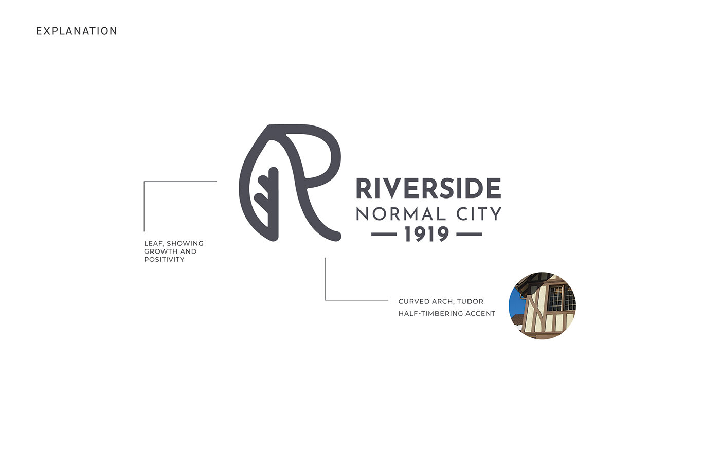
The Riverside Normal City identity is based on components of the architecture in the neighborhood. The slant in the leg of the “R” is modeled after the same curves present in the architecture of Tudor-style homes. The patterning on the outside of the walls is called half-timbering, and it is one of the defining characteristics of many homes in Riverside Normal City. There is also a leaf shape on the other portion of the “R”, referring to the growth the residents of Riverside Normal City are creating within their neighborhood.


